ABOUT
Anthony Coragliotti | CIS 155
Version 1 (2019 JAN 18)
In Version One (V1) of my website, I created three documents: index.html, about.html, and styles.css
Within the Body element, I added: A Navigation Menu Div elements to be used as containers; assigned class and id names.
Comments on Learning Objectives (In order of appearance): M2LO4a, M1LO6, M1LO8, M2LO4b, M1LO12, M1LO7a, M1LO13a, M1LO9, M1LO10, M2LO7, M1LO7b, M2LO3a, M2LO3b, M2LO4c, M1LO13b, and M1LO13c.
In the CSS file, I added: Styling in four sections: Defaults, Navigation, Misc Containers, and Text.
I also added comments on Learning Objectives: M2LO12, M2LO14, M2LO6a, M2LO5a, M2LO5b, M2LO11a, M2LO11b, M2LO15, M2LO13, and M2LO6b.
CSS Navigation styles impact: Safely confined within it's own container. Set menu background color to dark blue. Centered and spaced. Hyperlink and text color are set to white. CSS Misc Containers styles impact: The banner is centered at the top. A white center strip contains all text and images on the page.
Version 2 (2019 FEB 04)
In Version Two (V2) of my website, I created three more documents: ink-stories.html, ink-writing.html, and ink-inspiration.html
I completely revamped my page structure. I created 4 wireframes and went with the one I liked the best. The wireframe was a really helpful way to get things started.
I fixed the issues I had in V1 and made note of them at the top of index.html.
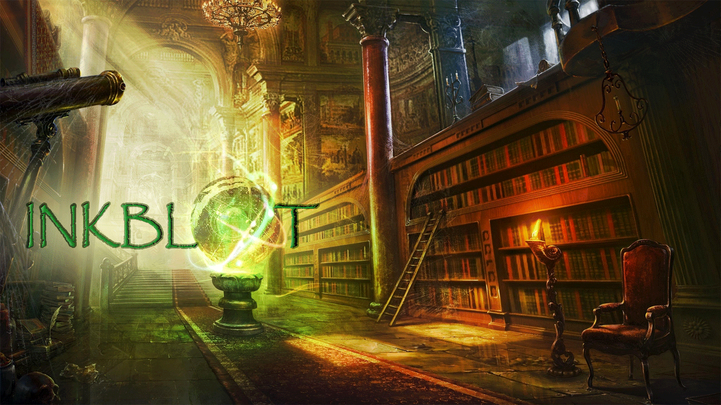
Content sources: The splatter graphic in the banner was obtained from http://clipart-library.com/clipart/2054530.htm The lettering in the banner is a Microsoft Corp font named "Segoe Print".
The fancy cursive font used as images is a Microsoft Corp font named "Parchment".
The fancy splatter font on the home page is a font from: https://www.fontspace.com/david-kerkhoff/windshield-massacre font name: Windshield Massacre Author: David Kerkhoff 2011
The background image is from: http://www.techpresentations.org/ks/splatter-wallpaper/#wopen_splatter-wallpaper_288493.jpg Everything else was drawn by me using photoshop or MS paint. CSS impact: The CSS in version 2 completely dominated my project.
CSS changed my page structure and required a new layout, specifically due to the addition of the float ability.
CSS gradient was a nice aesthetic addition I really enjoyed learning about and adding to my page.
It isn't CSS; but I also really enjoyed adding the area map.
Learned my lesson from V1 and ran a spell check (glad I did). I feel comfortable with my learning progress. I think the level I want to be at is only a matter of practice. I am pretty happy with my V2 project. It was a lot of work, but it was a lot of fun.
Version 3 (2019 FEB 17)
In Version Three (V3) of my website, I (once again) reconstructed my website from scratch; this time to incorporate the new concept of flexboxes. I started with a wireframe design that I eventually had to abandon as I learned more about using flexboxes and tables.
One thing I tried to do differently this version was to stay organized and constantly mind my page structure. I don't know how successful I was at this, but I drew a structure map and forced myself to constantly update it. I feel like it helped me to break out of my tunnel-vision a little more. I still had to go back and do a lot of cleaning up, but at least I knew where everything was. I think I even spelled my name right this time.
Taking on suggestions from the peer review, I designed a softer color-scheme (a tribute to Valentine's day) that was supposed to be pink, but looks orange on my phone.
I provided support for viewing my website from a variety of different screen sizes.
I added a table to my website.
Source attributions:
The banner image is from here:
https://www.goandroid.co.in/40-high-resolution-wallpapers-you-can-download-for-your-smartphones/67879/
The background calendar image on this about page
is from here:
https://stjohnsnorwood.org/wp-content/uploads/2017/03/calendar.jpg
Everything else has already been cited above.
CSS impact:
Wireframe. I tried to stick to the wireframe at first but, just like the old saying goes: when the going gets tough, abandon your wireframe. So that is what I did. I let creativity and necessity build my webpage for me. They are a benevolent couple.
Screens. Adapting to different screen sizes while maintaining continuity required a change of layout; which I enjoyed doing. I think my website appearance has improved because of this adaptability change.
Flexboxes. Ah, flexboxes. Hmm... This is my first introduction to the flexbox and my opinion of them is bittersweet. Flexboxes have a lot of features I've always hoped to see in CSS, but I found the command syntax to be unintuitive and confusing. As I got more comfortable with using flexboxes (lots of practice), I kinda understand the name conventions, but I think they could have been more... symmetrical.
Tables. Tables are pretty straight-forward, I have experience with them, but using CSS to style tables was a new experience for me. CSS makes table management so much easier by applying a single style command to the entire table, instead of styling each and every single anatomical section. I am glad those days are over. Hurray for CSS!
Version 4 (2019 MAR 03)
In Version Four (V4) of my website, I drew up a wireframe. I embedded a video in an iframe. I animated an image. I did my best to make everything sale with the size of the browser. Oh, and I updated the colors for a St. Patrick's day theme.
Sadly, I did not provide much content this version, but the impact of CSS that I did add was dazzling. Animating images, displaying video recordings, and styling it all with cusom code. CSS has so much more potential than I could have imagined.